Work/Lifestyle
Soch & Sabar
Logo Design & Brand Book
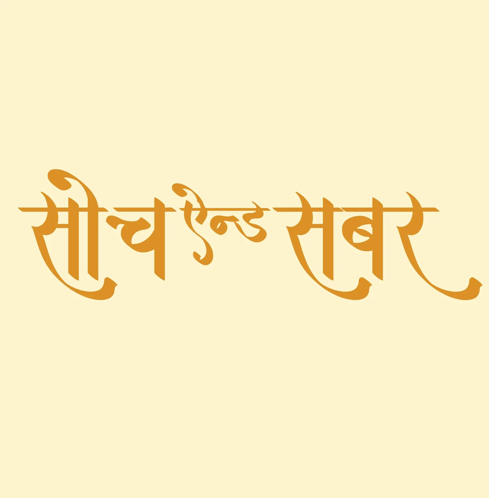
The name had to be read in Devanagari and in English without becoming two different brands.
Work/Lifestyle
Soch & Sabar
The name had to be read in Devanagari and in English without becoming two different brands.
The outcome
The brand carries one wordmark across scripts, with a documented colour palette behind it.
Sector
Lifestyle
Scope
Logo Design & Brand Book
Delivered
5 creatives
Client
Soch & Sabar
Scope
Logo design, colour palette, brand book
Identity
Devanagari wordmark
Services
To build one identity that survives two scripts. The name lives in Devanagari and in English, and both have to read as the same brand, not as a logo and its translation.
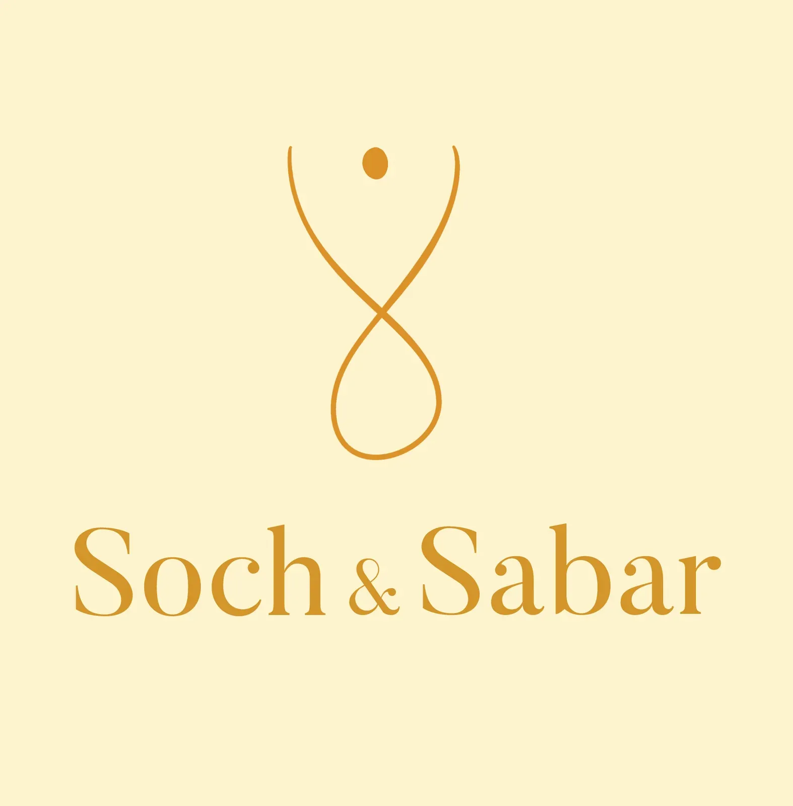
The wordmark was drawn by hand in Devanagari rather than set in an available typeface, so the brand owns its letterforms, with a Latin lockup built to match its weight and rhythm. Three variants cover the places a brand actually appears: full lockup, stacked and standalone.
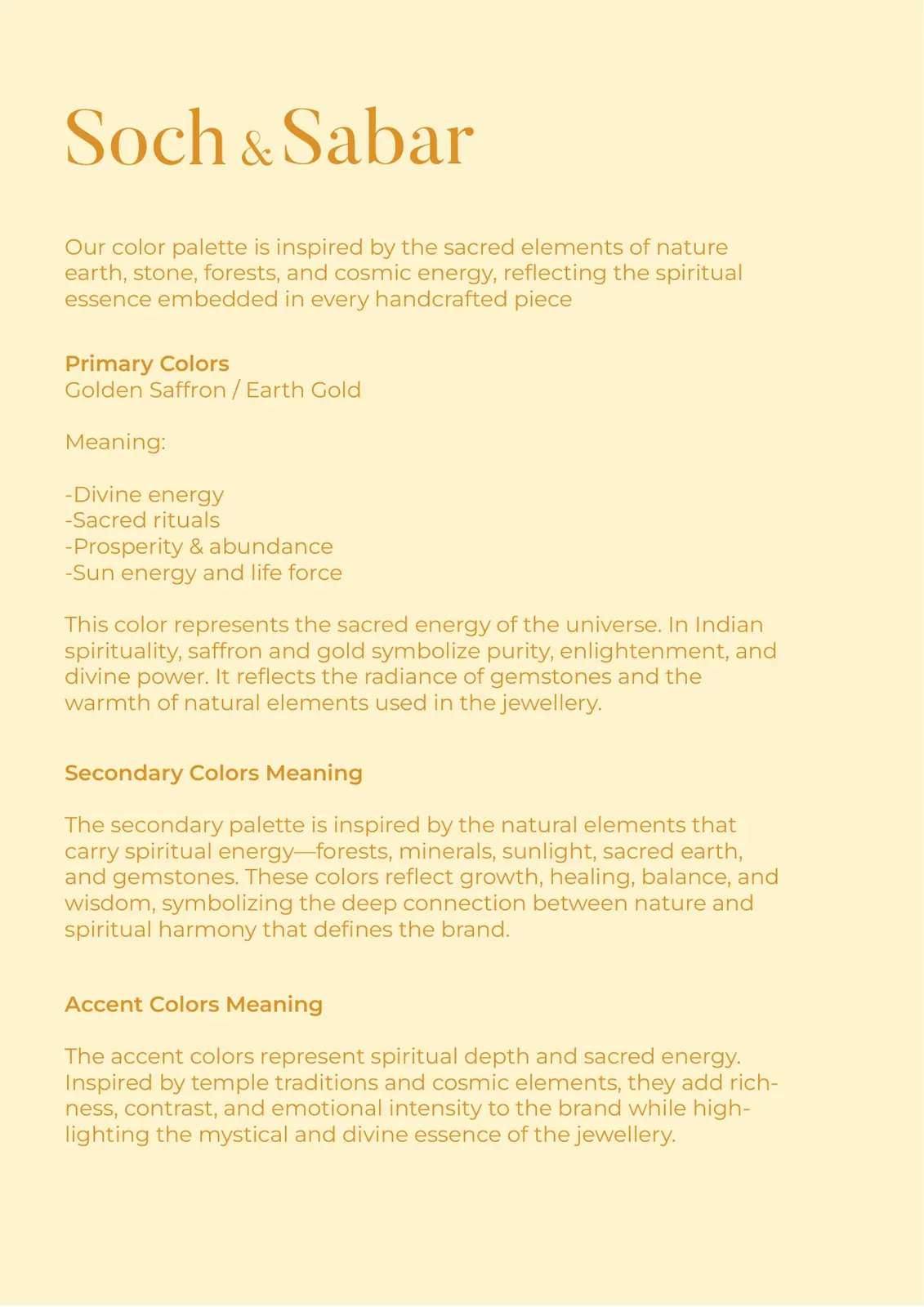
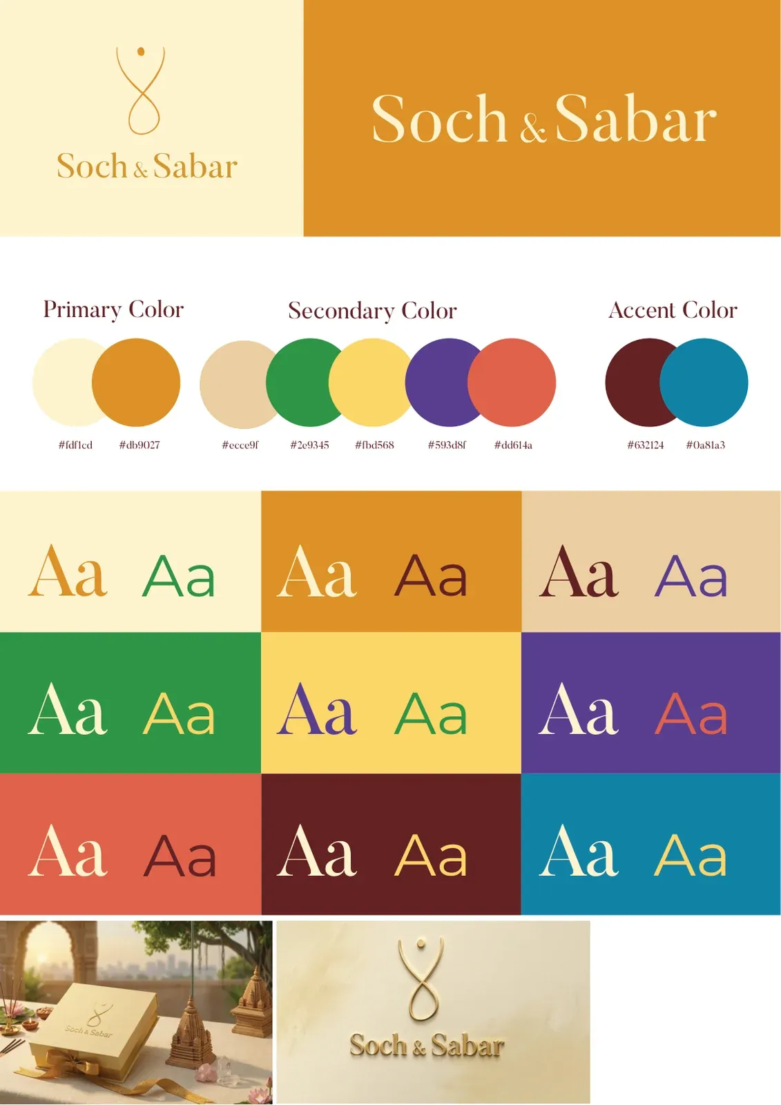
The colour palette was documented rather than just picked, primary and secondary colours, what each is meant to carry, and where each applies, so the brand stays itself in hands other than ours.
3 pieces

2 pieces
Key takeaway
A bilingual wordmark is one drawing, not two, the moment it becomes two, the brand splits.