Work/IT / Technology
BOWNH
Logo Design & Brand Book
BOWNH is an AI tooling startup, and it wanted a mark and a colour system that read as its industry, software people would recognise it as built for them, not as a generic tech logo.
Work/IT / Technology
BOWNH
BOWNH is an AI tooling startup, and it wanted a mark and a colour system that read as its industry, software people would recognise it as built for them, not as a generic tech logo.
The outcome
BOWNH now has a complete identity system: the mark in every lockup it needs, and a three-tier colour palette with a defined job for each tier.
Sector
IT / Technology
Scope
Logo Design & Brand Book
Delivered
8 creatives
Client
BOWNH
Category
AI / Startup tooling
Scope
Logo design, brand book
Services
BOWNH is an AI startup co-founder built to help founders think, validate and execute with strategic clarity. Designed to bring structure to modern startup building, it turns ideas into execution-driven systems through intelligence, validation and strategic direction.
To land the brand inside its category. The ask was an identity that signals AI tooling on sight, a mark and a colour language that sit naturally next to the products its users already work in, rather than a logo that could belong to any startup.
The mark is an infinite loop drawn as two arrows feeding each other (the think, validate, execute cycle the product runs on) delivered in black, white, dark and copper lockups plus a standalone icon for app and avatar use.
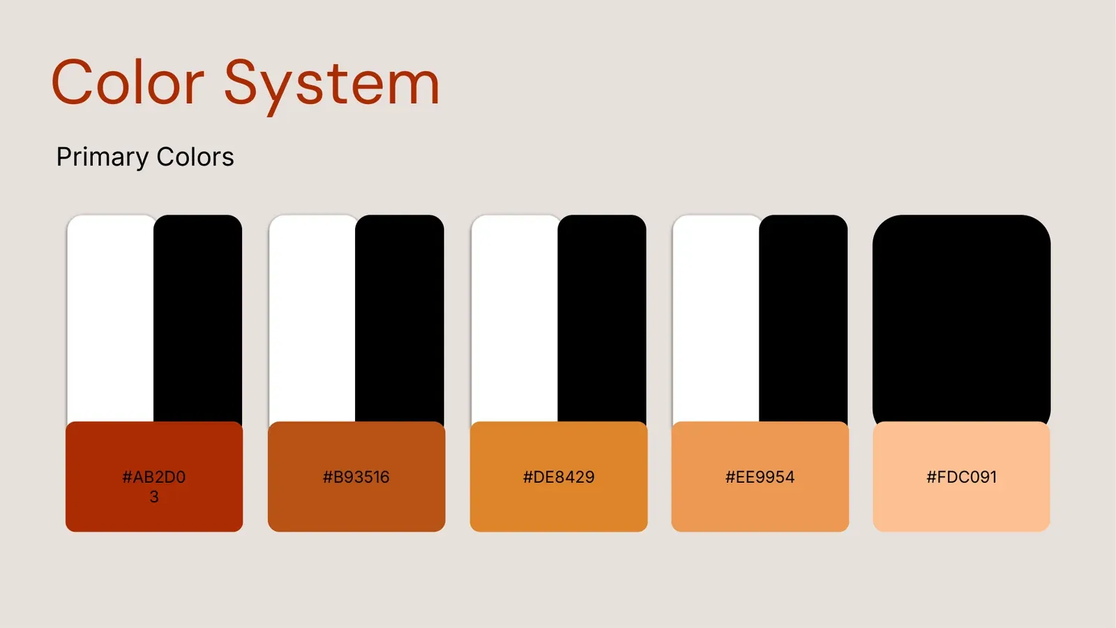
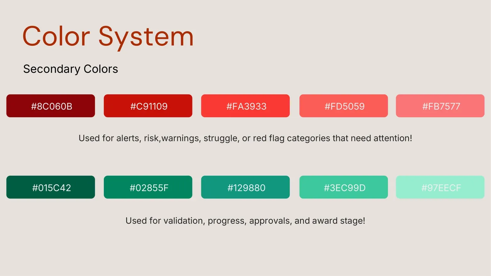
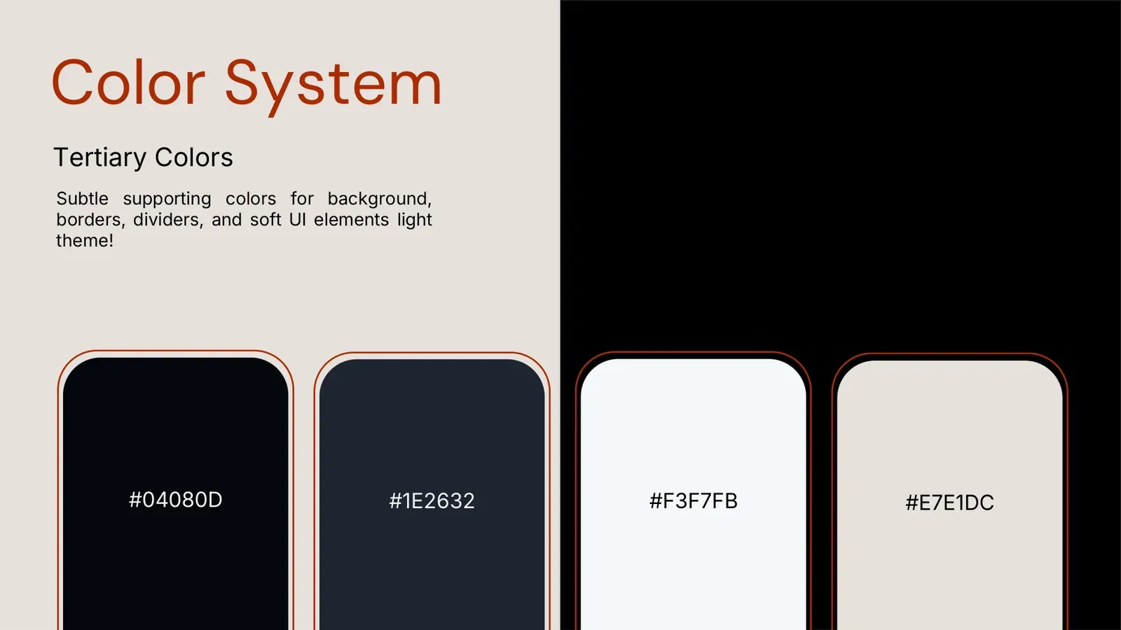
The colour system runs three tiers: a primary palette carrying the brand, a secondary set that codes meaning in the interface (reds for alerts, risk, warnings and struggle; greens for validation, progress, approvals and award stage), and tertiary colours for backgrounds, borders, dividers and UI elements.
5 pieces



3 pieces
2 themes


Key takeaway
A mark only stays a brand when the colour system behind it has rules, what each tier is for, and where it applies.