Work/Health and Wellness
Secret Essence
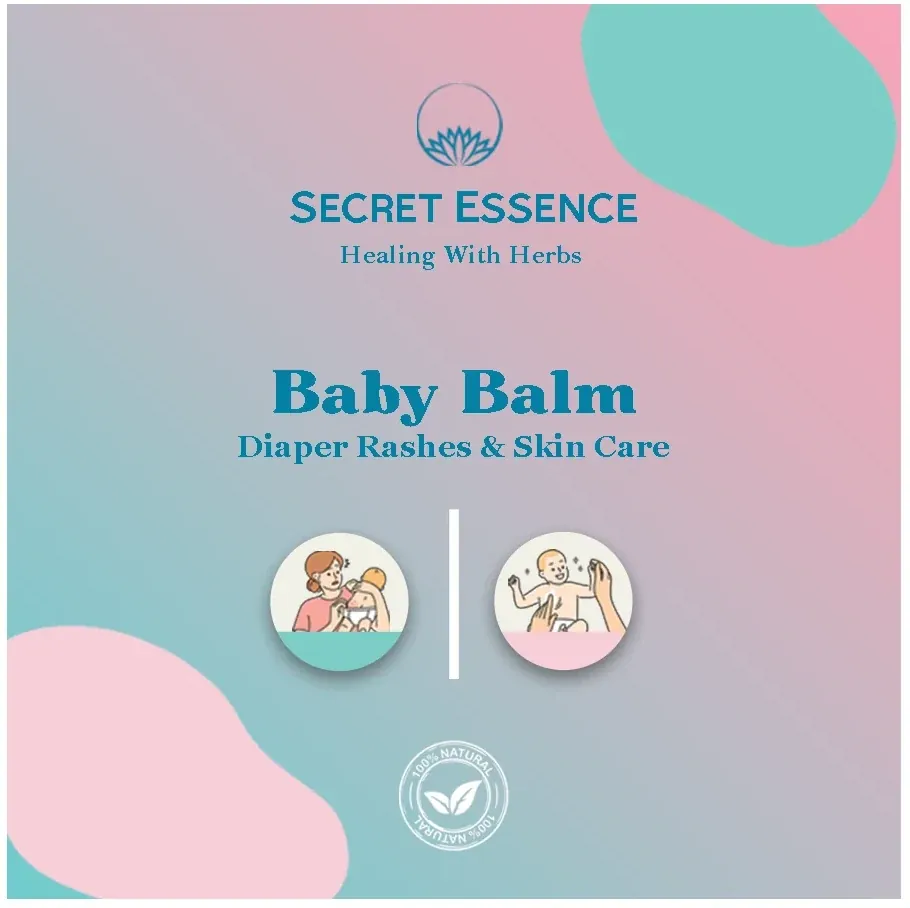
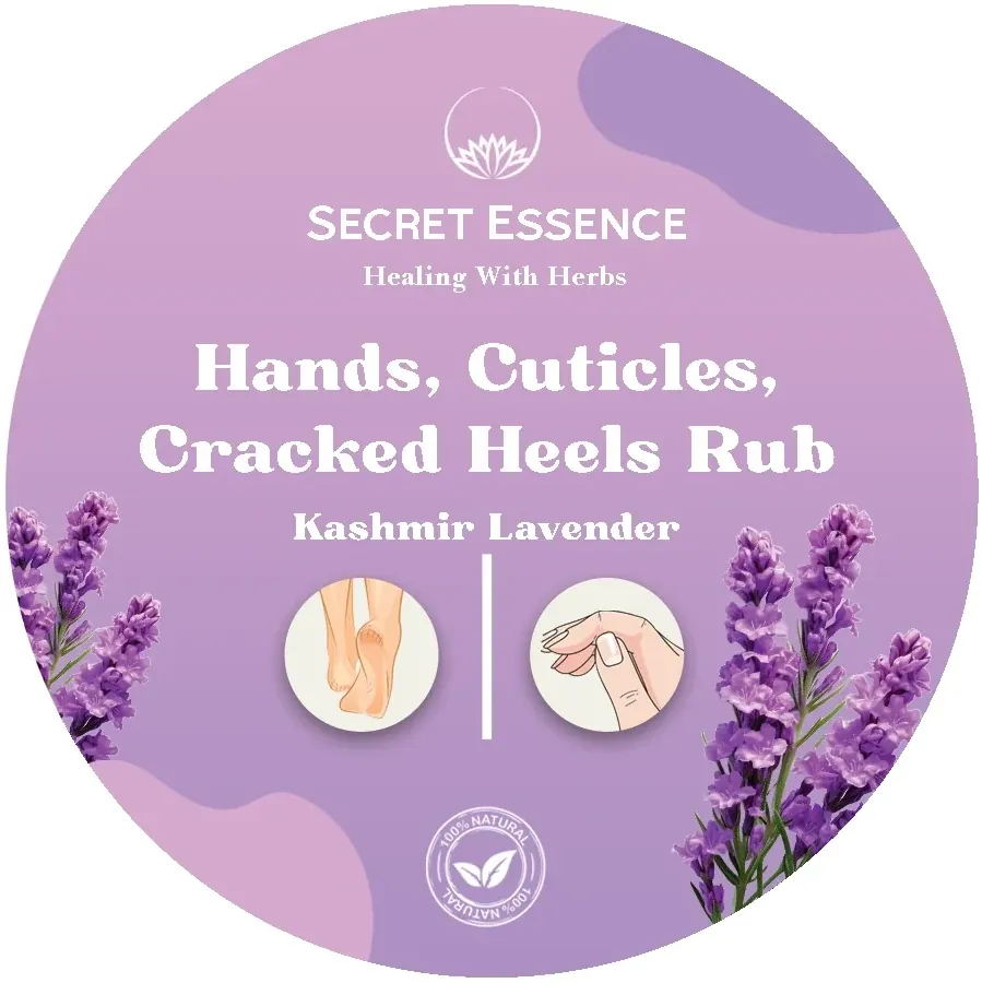
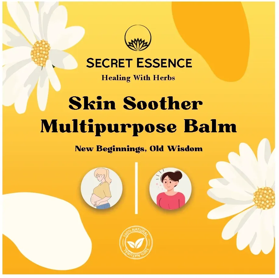
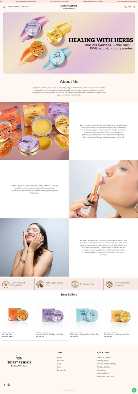
The range is bought for the very old and the very young, so the packs had to speak to both, carried by illustration rather than copy, with each pack leading on the one ingredient that does the work.
The outcome
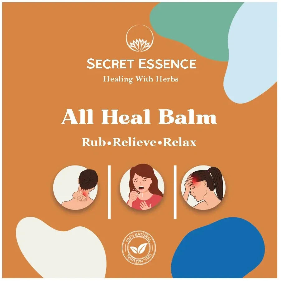
The range reads as one system with four clearly distinct products: a shared illustrated architecture across All Heal Balm, Baby Balm, Balm and Skin Soother, each fronted by its own key ingredient.
Sector
Health and Wellness
Scope
Packaging & Design
Delivered
15 creatives
Client
Secret Essence
Category
Herbal skincare
Scope
Packaging design
Services
Secret Essence is a herbal skincare brand built around balms and soothers, used across the family from babies to the elderly.
To design packaging that reaches the two ends of the household (older buyers and children) without asking either to read a label to understand what a product is for.
Illustration carries the pack rather than product copy. The artwork does the explaining, which is what makes the range legible to a child and to someone who would otherwise need their glasses to read the back of a box.
Each product leads on its own hero ingredient, so the four packs separate on shelf by what is inside them rather than by name alone, while one shared layout keeps them reading as a family.
4 pieces
10 pieces
2 pages


Key takeaway
When a product is bought for both a baby and a grandparent, illustration does more work than copy.